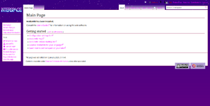
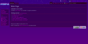
I'm leaning toward getting rid of gradients in the tab items. The purple can already be a little overbearing/hard on the eyes (just a natural result of it being a brighter color) and I don't think the gradients help readability that much.
Would you consider using the new vector skin? E.g. what Wikipedia uses now. The customization features (especially width control) are really pleasant. It would admittedly be harder to incorporate a star image in the background (like you have right now), but I think that a flatter dark purple theme similar to the forums could be nice.
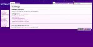
Possibly adding a small light purple/magenta gradient to go alongside the light theme for visual parity? I've sent an example below - the solid white over the gradiented background creates an unpleasant contrast, and I think it would fare better if there was at least a bit of colorization on that part just to make it easier on the eyes.